Blog
Our 3 Top Ecommerce Sites for 2015
 In the era of ecommerce, your company’s website has taken the place of the smiling face behind the counter, the connection between buyer and seller. Your website has become the first impression, your only and best sales person. It has become the image of your company, literally.
That said, your website design needs to be seamless and user-friendly. It needs to be easy for your customers to handle and navigate, free from confusion or hassle. Of course, it should be creative and unconventional, without overkill or business.
This is not all as easy as it sounds. To give you some inspiration, here are three ecommerce sites, which made our list of companies doing it right in 2015.
1st Impression:
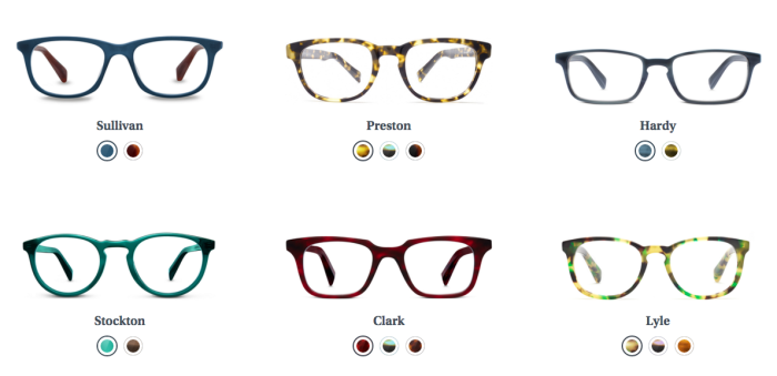
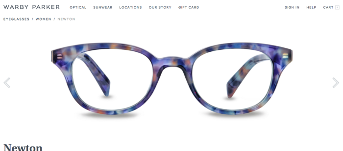
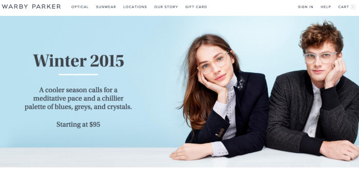
With a sleek and fashionable interface, Warby Parker has actually achieved in making shopping for prescription glasses fun! WP will deliver five frames to your home for free, keep for five days to try on, and return with a prepaid label. For every pair purchased, a pair is donated.
Key features:
The product shots need to be clean and appealing. Being that the product is fairly small, the frames are displayed in large size on the screen. You can see detail. They have included a model shot in various angles in order to view the entire frame. Adding your five frames to your cart is easy. The only obstacle you may think of here is sending your prescription. They have kept that process very simple with a fax or email submission.
They offer a live chat box, which is wise in this case. When shopping for something as specific as glasses, you definitely want the convenience of immediate service.
1st Impression:
This is different from our other featured ecommerce sites listed, as there are no products on this site. This is an all-in-one personalized shopping experience. You create a styling profile by taking a quiz. A stylist is then assigned to you and hand-selects pieces to arrive at your door, fitting your style and budget.
Key features:
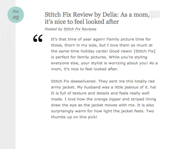
Without products to woo the customer, they needed to focus on visual appeal here, as well as an easy to understand explanation of how their process works in order to win over the sale. By scrolling through the first page, the step-by-step process to place your first order is easy to navigate. If you are not convinced this is for you, or that you can trust someone else with enhancing your personal style, they have included plenty of up-to-date reviews from their clientele. Stitch Fix was very wise to include a photo of each reviewer in their new gear. Not models, but real women, different shapes, sizes, and styles. The review section is where I would go before sending my first order if I needed a little convincing.
1st Impression:
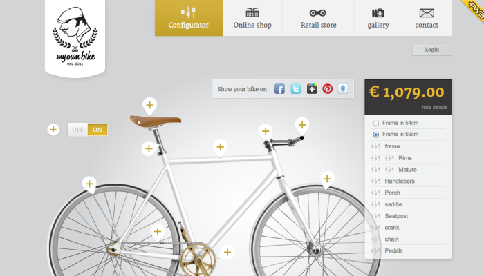
Even in German, I can understand how to navigate this site! They have made the would-be complicated task of designing your own bike pretty simple!
Key features:
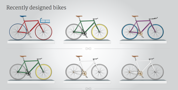
They feature recently designed bikes to help give you ideas for your own. It’s also a smart way to get your customer to add on extra gear or colors they may not have thought of initially. They have broken down each part of the bicycle so you can easily order 1 part at a time without getting overwhelmed. The website is fresh, sleek and straightforward. It’s no fuss, no muss, and oh so very German.
There are many needs to cater to when building an ecommerce site. Your main focus should be designing a functional site that can easily generate interest and traffic. The user interface design and speed of your site plays a vital role in bringing high volume web traffic to it.
When it comes to ecommerce, interactivity can play an important role. The interactivity of a website can be enhanced by using the tools like online chat, responders, email. Online chat is the best and most immediate option. A pleasant and prompt chat between customer and representative will make the difference between a sale and no sale. You must replace face-to-face interaction with the next best thing, an online chat option. Do not lose site of providing Exceptional customer service. This is one way to supply that. It is essential for customer satisfaction and retention, as well as profitability.
We know that everyone is using their mobile devices to connect, surf and shop. So if your ecommerce site is not optimized for mobile traffic, you are losing potential customers and sales. For more tips on the importance of optimizing your mobile campaign here.
Tons of people are using Pinterest as a potential wish list when browsing the web. Make sure your product detail pages are easily Pinnable with a quality image of your product. Same with the ability to share on Facebook and other popular SM platforms.
For success in any ecommerce site, a user-friendly website is a must as it will provide enhanced user experience to the online visitors. Any site that is too complex and difficult will definitely push away online traffic. Give your site curb appeal without making it complex. We hope DEP’s tips give you some ideas in improving your ecommerce site!
– Christina Essabba | SEO Associate
Categorised in: Ecommerce, SEO
This post was written by downtownecommerce_admin
